
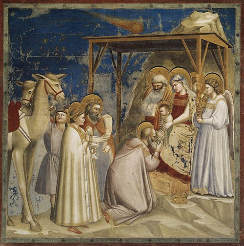
10 years ago, I came to a sudden stop while walking inside a busy shopping mall: I noticed flickers of movement on a glass-like surface. Moving closer, I realized it was a thin glass display with a product promotion video playing in front of a show window.
Later, I looked up online and found out that it was a prototype by Samsung. It was almost magical to watch the gorgeous visuals unfold on a transparent surface with a reflection of the scene behind the glass. How did they handle backlighting? Is the color black showing up as transparent? Questions crowded my thoughts but I was simply dumbfounded by the sight witnessed.
The idea of being invisible/transparent has been humanity’s obsession for centuries. Ghosts are translucent in movies and invisibility cloaks as seen in <Harry Potter> or <Doraemon> assist with escaping reality. Initial attempts to bring back deceased musicians using hologram have now popularized the concept of hosting holographic concerts online for many K-pop singers today. There’s always a sense of awe when it comes to making things transparent.
‘Clear White Light’ Created by ‘Colors’
Transparent color may come across as a lack of color, but it’s actually a combination of all colors in the color spectrum.
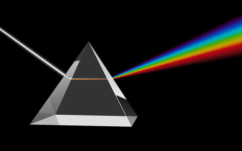
Published in 1704, <Opticks> written by Isaac Newton about the research of the relation between light and color refracts white light with a prism, proving that white light consists of a spectrum of colors. Newton’s argument along with his conceptual arrangement of colors was deemed revolutionary by many scholars, instigating a movement around schematizing his color wheel. Newton’s original color wheel in <Opticks> is colorless.

Newton’s circle was drawn black-and-white, with points A to G creating boundaries like a scale around the colors red, orange, yellow, green, blue, indigo and violet. These colors - commonly known as ROYGBIV - are a common sequence of hues of a rainbow. Just like a semitone in music, Newton's “octave” of colors had orange and indigo placed at the half steps. It was a very scientific observation made by Newton as color brightness and saturation were not directly expressed in his color wheel. He insisted that all colors between white and black had tones of gray. Evidently, to prove that the prism was not coloring the light, he refracted the rainbow-like spectrum back together into white light.
Idealized Reality of Achromatic Colors in the Past
Asian countries influenced by Chinese characters have an understanding of white as ‘transparent’. Definition of white (白 in Chinese character) includes definite, clear, pure, and absence of things. The traditional Korean color spectrum, also known as Obangsaek*, is the color scheme of the five traditional Korean colors of white, black, blue, yellow, and red, representing five cardinal directions. Yellow, which is similar to gold, is considered as 'King' and is located in the center. Similarly, the other colors depict each direction of the compass; "white" as the west, "blue" as east, "red" as south, and "black" as north. Basic colors of the color system for both eastern and western cultures include white, black, red, blue, and yellow. However, whereas Isaac Newton’s colors are comparable to that of musical notes on a scale, Asian understanding of color such as Obangsaek integrates colors with cardinal directions.
*traditional Korean color spectrum
Difference between Western and Eastern ways of thinking is also revealed in the color system. The Thousand Character Classic, a 2,000+ year old best-selling primer for teaching Chinese characters to children, begins with the following sentence: "Heaven and Earth Dark and Yellow". Did the millions of children in Eastern Asia using this famous book to learn Chinese characters fully understand what ‘Dark Heaven’ means? Perhaps - as darkness (玄 in Chinese character) found in the night sky carries mysterious energy found in the universe.
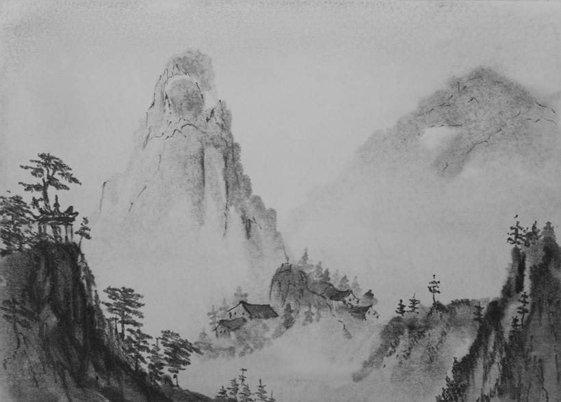
In the old days, Asian people considered the achromatic world as an ideal world. They saw colors as unnecessary expressions of vulgarity disrupting order. Because of this idealized notion of colorless mentality, Asian artists captured the world around them in monochromatic realms of reality by changing the saturation. The Northern Landscape Style* artists often used colors in their paintings, but in general Asian painting represented by the Southern School of Chinese** preferred black ink paintings.
*The Northern Landscape Style was an art style by a specific group of artists who worked and lived in Northern China during the Five Dynasties period.
**The Southern School of Chinese painting was an art style by artists who opposed the formalities of the Northern School of painting.
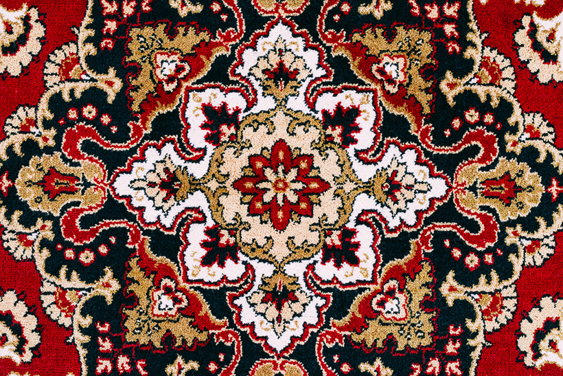
Idealization of a black and white aesthetic is not unique to ancient Asian cultures but in other cultures around the world. Ancient Islamic civilization was rife of white, black and ivory. Colors normally forbidden for public use were used in decorations such as Persian rugs and art depicting text from the holy book of Quran. Even people in the United States experienced social qualms about colors as tawdry outcries of the nouveau riche: Literary works such as <The Great Gatsby> and <The Rise of Silas Lapham> portrayed contempt towards “new money” and their extravagant display of colors.
Psychological vs Scientific Color System
Since the end of the Renaissance period, debate between black and white vs. color aesthetics had been contentious in Europe: More specifically, it was tension between Disengo (Drawing) vs. Colorito (Painting). The Venetian School's groundbreaking emphasis on colorito, or using color to create forms, made it distinct from the Florentine Renaissance emphasis on disegno, or drawing the forms then filling in the color (The Art Story). Leonardo Da Vinci’s meticulous art pieces and Filippo Brunelleschi’s scientific perspective in art prevailed during the Renaissance era.
With Tiziano Vecellio touted as the greatest Venetian artist of the sixteenth century, the Venetian School experienced a period where the public underestimated its art as inferior for lack of precision. As a result, the European Academy of Arts during the 17th century exemplified Disegno (Drawing) as a standard for realistic drawing, which still impacts art students today. Ironically, Renaissance - which means “rebirth” - ended up encouraging the demise of colors. Use of colors in art saw a revival during the Belle Époque*, Impressionism** and Fauvism*** era. With synthetic pigments on the rise instead of expensive natural pigments, artists experienced a plethora of motivation for painting.
*The Belle Époque refers to a period between 1880 and the outbreak of World War I in 1914.
**Impressionism is a 19th-century art movement.
***Fauvism was the first of the avant-garde movements in the early years of the twentieth century.
Strong psychological triggers rather than scientific logic explained people’s preference for Disengo (Drawing) over Colorito (Painting). Whether it be blue representing the purity of the Virgin Mary or red arousing excitement, colors were chosen carefully by artists to portray general psychological expectations. That was why the first pigment bought for any Virgin Mary paintings was cobalt blue. It is important to note that rare pigments like cobalt blue were more expensive than gold at the time. Art technique of mixing colors (in the order of yellow, orange, red, brown, green, blue) on a palette only became prevalent in the 18th century.
Considered a sacred color for centuries, blue became more accessible to artists with the mass production of Prussian blue (blue pigment) in Germany. Availability of a once ‘Godly’ color allowed room for debate: German writer and scientist Johann Wolfgang von Goethe questioned the validity of Newton’s scientific approach to color and published Theory of Colors, which seeked to characterize physiological colors (how colors affect us). Goethe simply could not stand the trend of quantifying colors while ignoring the long tradition of color aesthetics.
Display - Capturing Every Color with Digital Color Technology
Since Newton’s theory of color, endless debates and discussions for a new color system took place. That was the impact of Isaac Newton’s discovery in modern history. Of course, he was not the first person to suggest color spectrum. Ancient Greek philosophers such as Pythagoras and Aristotle also developed theories of color and "founder of geometry" Euclid also studied optics like Newton.
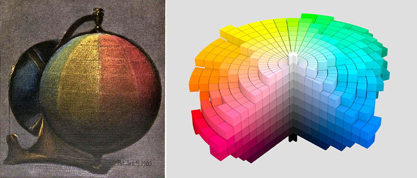
Albert Henry Munsell’s color system was popularized after Newton, with the two-dimensional color wheel turned into a three-dimensional color sphere (A Balanced Color Sphere). His proposal to construct a Color Appearance System based on the relationship between Hue, Value, and Chroma gained popularity at the time, but even more so later with the creation of color systems such as HSL (Hue Saturation Lightness) and HSB (Hue Saturation System) Brightness). It even influenced the CIE 1976 color space (CIELAB) of the Color Mixing System.
Computer graphics programs create all colors by combining the three primary colors of light commonly known as RGB (Red, Green, Blue). Brightness and saturation are adjusted by the amount of other colors as well as their own. For example, if you want to express warm red in terms of RGB, you need to lower levels of red and add more blue and green to the equation. Under the Munsell or HSL system, you’d decrease the brightness and saturation of the color red. It is easy to conclude from this that colors have relationships to each other.
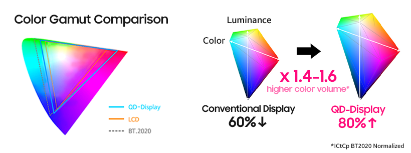
Upcoming IT products/trends and changing expectations about viewing environments by consumers fosters a sense of continuous development to showcase life-like digital colors with technology.
Remember the frenzy behind The dress - a photograph that became a viral internet sensation in 2015 with people arguing over whether the dress pictured was coloured black and blue, or white and gold? Differences in human colour perception is common. Ultramarine (a deep blue color pigment) in a bright environment looks different from that same color under a yellow-colored light in a dim room. When Pablo Picasso left Spain to start working in his art studio in Paris at the age of 20, there was no electricity: With Picasso relying on candles in a dark room to work on his paintings at night, it is no wonder why the Blue Period of Picasso* works are bluer in natural light.
*The Blue Period of Picasso is the period between 1900 and 1904, when he painted essentially monochromatic paintings in shades of blue and blue-green (Pablo Picasso).
Picasso's rich blue color actually looks like a deeper shade of gray under yellow light. This is why Newton argued that gray contains all colors. This also explains why around the same time as the Blue Period of Picasso, Munsell constructed a colour sphere which he termed ‘balanced colors’.
Larger and wider color expression is one of the core focuses of display device evolution. From translucent white to the pitch dark abyss of the black hole - the future of display will be capable of capturing every color in the spectrum of our reality.
