
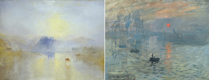
Summer brings clear blue sky and white fluffy clouds without a hint of fine dust. Cicadas sing from lush green trees as flocks of clouds floating in the blue sky bring together ever-changing, spectacular scenery. People who get lucky enough to catch a glimpse of a rainbow after a shower quickly take out their phones to take photos. The pinkish sunset of a summer evening with the lingering heat of the season is more picturesque than a William Turner’s painting. Turner is one of the household names that represent English Romanticism. His paintings, as suggested by the word Romanticism, are defined by their ambience and sentimentality rather than accurate representation of forms. The most crucial element in his uniquely romantic paintings is color.
Turner’s paintings are filled with colors. The free, bright brushstrokes amplify the fluidity of the landscape and show the passionate marriage of forms and colors. Turner’s works, where colors come alive, influenced the subsequent birth of Impressionism. Comparison between Turner’s painting of a sunrise and a sunrise over the sea depicted by Claude Monet — the founder of Impressionism — illustrates what they had in common: both artists captured impressions of colors than forms. They moved away from adhering to old ideas of colors and aspired to capture the vibrancy of colors. They brightened up paintings.
We see bright colors everywhere now. From the small screens of our smartphones to TV displays, we’re surrounded with vividness. Brightness of everyday spaces we enjoy today would be beyond comparison with that of the Impressionist era. What strikes many Koreans travelers in Europe is how dim the lights are. From the streets to houses, it becomes very dark everywhere at night. Most shops, apart from supermarkets, are dimly lit — a reason why a majority of Korean travelers find the night scenery in Europe oppressive. Once you adjust yourself to such dimly-lit environments, however, you become sensitive even to the faintest light. What this means is living in a dark environment gradually heightens your ability to distinguish your surroundings to the point where you don’t need brighter lights.
Now, we can only imagine how much darker it must have been in the past when there was no electricity. Candles and oil lamps were hardly enough to brighten up the pitch-black darkness of the night. Everyone was used to darkness. Hence, the paintings that were painted under the candlelight were enough to appreciate even though it was colored with dull colors. Surfaces of paintings covered with oil paint gently reflected the light from the candles for people to see the textures. After a long period of darkness, the rapid scientific and technological advances of the late 19th century suddenly lit up cities around the world. In order for paintings to stand out under bright, artificial light, the colors had to be as close to the primary colors as possible. Mixing the colors would make the resulting color dull and darker. In a world that was well-lit, vibrant colors were essential.
Visual System that Perceives Colors and Color Calibration
The colors that we perceive change according to the surrounding light.
This simple fact creates extremely complex issues in real life. Anyone who has tried taking and sharing photos and videos often faces a challenge with white balance. The problem is attributed to the fact that white is subject to change depending on the surrounding lights, from yellowish to bluish hues. The ‘Illuminant D65,’ defined by the International Commission on Illumination (CIE) as pure white light, corresponds to the midday light during the summer solstice in the central and northern regions of Western Europe. However, it’s impossible to recreate the same condition every time we need to adjust white balance.
The best we can do to optimize white balance in our daily life is to take a 6,500K color temperature as the basis of white light. The problem with this calibration, however, is that a seemingly pure white can look like a different color if there is interference of, for instance, a yellow light source. Hence, the most challenging environment for adjusting white balance is when lights of varying light temperatures are mixed in a single location. Images taken in such environments may not be able to capture colors accurately. One of the most well-known examples of this problem is “The White-Gold vs. Blue-Black Dress Debate” in 2015. A blue-and-black dress was photographed under a yellow illumination, which the black color absorbed, hindering accurate color perception and eventually sparking global attention. What started as a simple photo uploaded on Facebook to ask people’s opinion on the dress color quickly amassed over tens of millions of comments, not only shining light on the topic of accurate color perception, but also contributing to the surge in scientific research in color perception and the optic nerve.
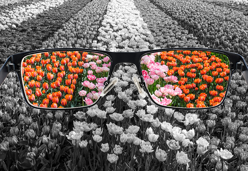
The process of color perception varies marginally depending on individuals. While some people are sensitive to bright light, others cannot see very well at night. Blue-green colors such as cyan can be perceived differently depending on whether you are sensitive to green or blue. Perception of color starts from our eyes and continues through the interaction between the optic nerve and the brain, which involves a significant level of subjectivity. For instance, the blind spot — located where the optic nerve fibers converge right at the center at the back of the eye — does not perceive sight, but the brain simply fills that visual gap. It wouldn’t be an exaggeration, in particular, to say that everyone perceives the color of the same object differently.
The retina of the eye has two types of light-sensitive cells called rods (detects brightness) and cones (detects colors). The distribution of these rods and cones varies from person to person and the number of pigments within the cones that absorb the primary colors of RGB is also different for everyone. Color vision deficiency — commonly known as color blindness or color weakness — occurs when there are problems with the cones’ photopigments. Over 2 million Koreans, or 6% of the population, are reported to have color vision deficiency.
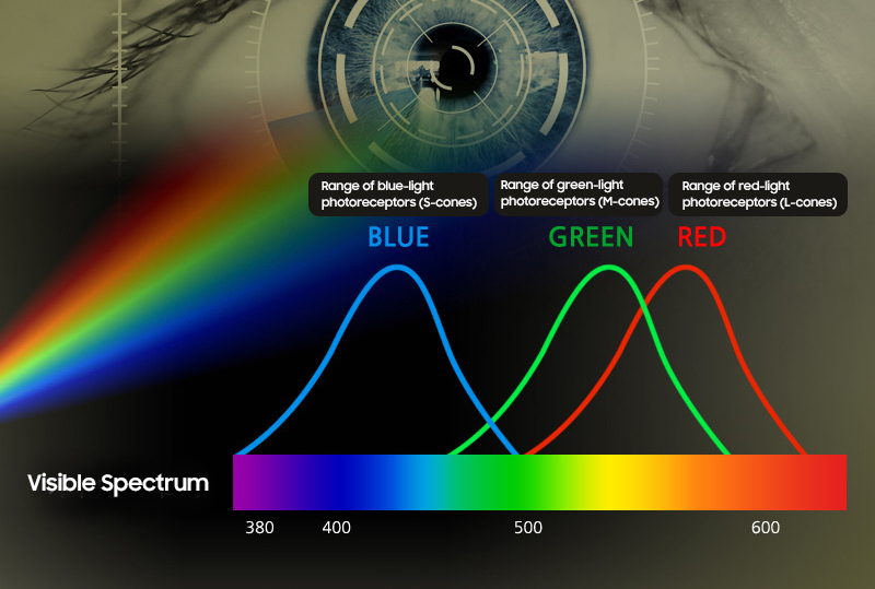
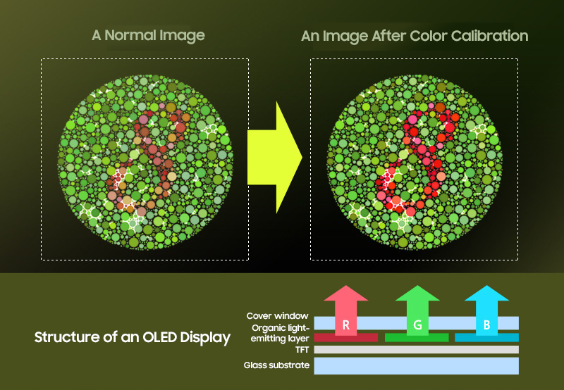
Very few people have color blindness that completely prevents them from seeing a particular color. Most people have color weakness just with different levels. Inability to clearly discern red out of the primary colors of RGB is referred to either as red color blindness or red color weakness, while the inability to clearly distinguish green is referred to either as green color blindness or green color weakness. The inability to see the combination of red and green are referred to as red-green color blindness, which most of those with color vision deficiency fall under. Those who have red-green color vision deficiency perceive most of the colors on the visible spectrum as ochre and dull olive green. But as the levels of saturation on the color spectrum is minute, color vision deficiency usually creates no major hindrances to daily activities. Relatively fewer people have blue-yellow color weakness and blindness. Now we have displays that are equipped with a color calibration function for those with color vision deficiency. An OLED display is a light-emitting display that can control individual pixels’ brightness. As it can freely control the saturation of the primary colors of RGB, it can not only deliver richer color expressions, but is also considered to be suitable for use as a smartphone display that can calibrate colors for users with color vision deficiency.
Even if you don’t have color vision deficiency, you perceive colors differently from others. Therefore, it may be a little more than difficult to define what is objective and accurate when it comes to a color. In the way that pure white is the combination of various other colors — as Newton’s prism experiment proved — each one of us has a different color spectrum.

Color Perception of Animals

Color perception varies from person to person, but what about our pets, such as dogs and cats? Do animals perceive colors as humans do? When it comes to the ability to see colors, humans perform better than animals.
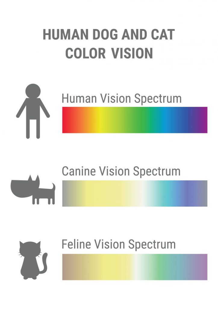
Dogs and cats have similar color vision of a person with red-green color blindness. On the color spectrum of a rainbow, they can only distinguish yellow, blue, and indigo. They perceive red and green as two similar yellowish hues. In addition, dogs and cats have poorer eyesight compared to humans; dogs have vision that is similar to near-sighted people with about 0.32 vision (an equivalent of about 20/63 vision), while cats have vision similar to far-sighted people. Many people are surprised to learn this fact about animals as cats can catch flying insects and dogs are known for their sensitivity to even the smallest changes in their environment.
Dogs and cats have better visual perception compared to humans in two aspects. First, they can perceive movements faster than humans. The reason why they can instantly catch fast-moving toys is thanks to their heightened motor vision. High motor vision equates to a high shutter speed in cameras and high frame rates in displays. Dogs and cats also have a layer of tissue in the eye called tapetum lucidum, which enables them to see better in darkness. This retroreflector in their eyes is the cause of their eyeshine in darkness.

From the pets’ perspective, the world of humans is, ironically, filled with light pollution. Lacking the ability of animals to see spaces and objects at night, humans tend to keep their surroundings lit. The white light that keeps every space bright, from the bedrooms to the living room, can impose a significant visual strain on the eyes of the animals as they are sensitive to light. In fact, the reason why pets get up when the light of their dark room is turned on and go around the house sniffing every corner is because of the excessive stimulation from the bright, artificial light. Bluish white light, in particular, is more harmful to animals due to the high color temperature. As animals have high motor vision, lights that flicker fast such as fluorescent lights quickly strain their eyes.
Lights or display devices with flickering light should be removed from the pets’ environment. Excessive brightness in the surroundings can overly stimulate the human optic nerve as well, straining our eyes. LED lights, the demand for which has been on a surge recently, are energy-efficient, but emit predominantly direct light, which will result in excessive visual stimulation for animals.
Much like humans, animals also exhibit slight differences in color perception and see the same object differently. We all perceive colors differently based on the characteristics of our optic system and the conditions of our surroundings created by light. The principle of embracing and respecting differences in others who coexist in the same space should also apply to the world of light.
