
Each year, summer is becoming increasingly longer, while fall is becoming shorter, probably due to global warming. Frosted young green leaves embody the sudden change in season. The wealth of colors of this season will soon be gone. The flow of change from the rich colors of fall to the black and white of winter and then to the vibrant colors of spring is a natural cycle of life, but throughout history, humanity has gone to great lengths to capture colors. Natural pigments offered only a limited range of colors for paintings.
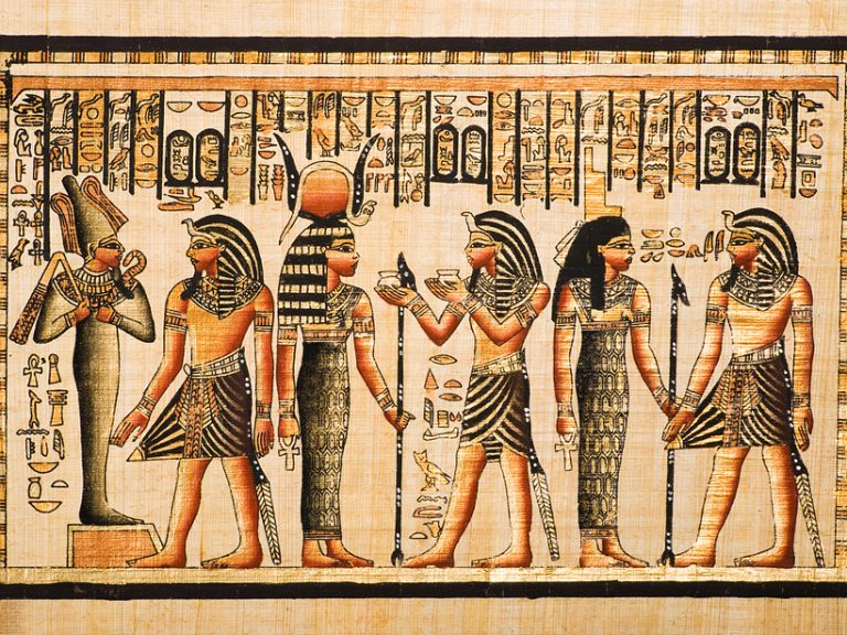
Dominance of black and white meant an era of text. The era of text written in black lasted long. Some instances of letters written in colors can be found in ancient Egypt, but prior to the early 20th century, letters were written in black. After the invention of printing technology, letters were printed in black on ivory paper. For thousands of years, when text ruled civilizations, colors were expressions of emotions devoid of knowledge or reason.
The invention of color photography in the late 19th century and advances in printing gradually introduced colors to the world of black and white. Shifts in social class, as represented in The Great Gatsby began in parallel with the introduction of colors. Meanwhile, during the same period, Confucian scholars of the Joseon Dynasty began to adopt more colors for ink-wash painting, moving away from the monochromatic convention. The transition from black and white to colors symbolizes the shift in times from the dominance of text to still and moving images.
You See as You Believe — Perception and Reproduction of Colors
The human endeavor to reproduce the colors found in nature began in the Old Stone Age with cave murals and has continued to this day with the metaverse.
Reproduction of colors is fundamentally based on color perception. What is more powerful than the optical, scientific color perception and reproduction is, in fact, the psychological, ideological perception of colors. Visual perception of the human eye is not as straightforward as what is perceived in the retina being recreated precisely in the brain. Multiple calibrations are made between the optic nerve system of the eye and the visual cortex towards the back of the brain. Through the process, unnecessary noise in colors is removed, and what is blocked by the blind spot is filled in. What professional photo editors do is, in fact, happening all the time between the eyes and the visual cortex at the back of the head. In a way, we are processing something we cannot see daily.

The famous proverb, “Seeing is believing,” should be rephrased to “Believing is seeing,” in line with science. As implied by the concept of local color of an object, we see the world as we think. In the same way, the colors that we perceive are ultimately the ones that we prefer to see. The Buddhist saying, “Form is emptiness; emptiness is formed,” teaches us that our mind is what controls what we perceive and appreciate. In a sense, it may not matter so much what comes first between seeing and believing as they are closely bound together.
It is, in fact, common to trace the origins of beliefs in and the symbolism of colors to religion. For example, gold and red in religious paintings from the Middle Ages are symbolic. Red, used as the color of wine, symbolizes blood sacrifice and is often associated with religious self-sacrifice. A person declared a saint after sacrificing his or her life is depicted with a golden halo in these paintings. Gold symbolizes nobility. In fact, we can find gold in many Hindu temples in India. It is the result of people’s faith that the dedication of gold to the temples will let them escape their karma.
Chinese emperors dressed in gold attire as proof of their noble existence. After the emperors passed, gold was considered to represent wealth and remains a symbol of wealth. Blue, on the other hand, is a color that signifies holiness. Artists used the ultramarine pigment, which is extracted from lazurite, a rare type of mineral, to paint the blue attire of Mother Mary.

Many color systems and theories seek to explain the relationship between chromatic and achromatic colors.
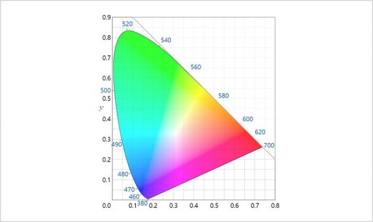
Every color in the world is found somewhere between pure and achromatic colors. Extreme color values such as neon yellow-green are rarely found in the natural world. The endeavors to expand the color range in displays and the innovations therein illustrate the deep desire to better express pure colors. As a result, the spectrum of colors in displays indicated on the CIE 1931 color spaces has been developing towards the edges, consisting of the primary colors. Professional display devices must be able to express colors accurately while, at the same time, expressing a wide spectrum of colors.
When everyone is in pursuit of developing a technology to express a wider spectrum of colors, some insist on monochromatic displays.
A leading example is e-ink technology, used in e-book devices. It consumes less power than color displays and is often considered superior in protecting the users’ eyes. This drives continued efforts to further develop the technology. It also helps that the belief remains that a monochromatic color palette is better than colors when attention is required for text. However, Gen Z and the following generations were born and raised with smartphones, watching videos on their devices. For the generations of people who grew up with color displays, consumption of text probably doesn’t require black and white displays.
A limited sense of colors is still forced upon new generations. It’s attributed to our old bias about colors as a society. Children generally begin to strongly prefer specific colors from around age 5. Boys tend to prefer blue, while girls prefer pink—which is primarily shaped by external influences rather than their innate tendencies. We conventionally distinguish the gender of a baby, either blue or pink.
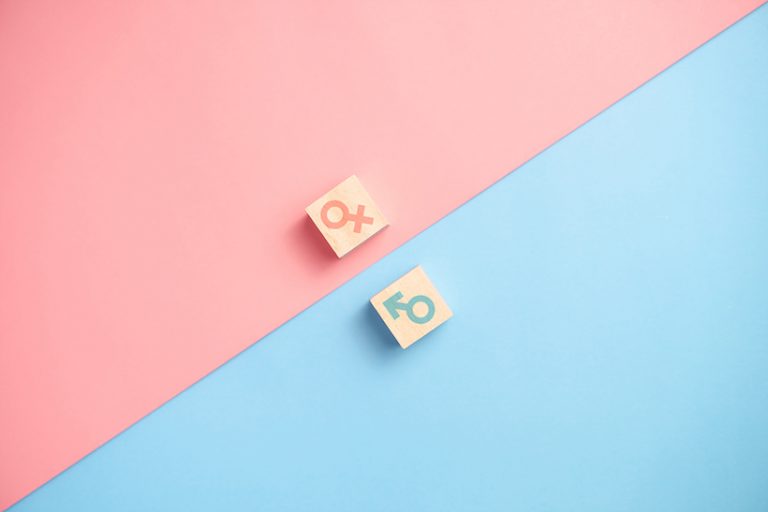
The stereotype of blue being the color for boys is such a powerful cognitive mechanism that boys are rarely seen wearing pink — a result of a strong collective bias about colors. Marketing campaigns for children’s toys, school supplies, and clothes have also significantly reinforced the stereotype. Stereotypes about colors naturally dissipate as children grow older, but a significant number of them grow to become adults with an obsession over what specific colors represent. In most of the spaces we encounter in our daily lives, red still indicates women, while blue indicates men. Everything from clothing to restroom signs and cosmetic packaging bolsters and adds to the color stereotype.
The World of Colors Extended into the Metaverse
Between late summer and fall every year, major global companies go into a race to launch the newest models of smartphones.
Striving to create a bigger screen for the smartphone while still keeping it small enough to fit into the palm of the hand, smartphone producers have been developing innovative form factors that could be folded or bent. The design also matters in this day and age to pique their interest in new technologies.
Consumer perception of the design of a product is largely shaped by the quality of the material and the nuances of the colors. Glass or reflective materials that are recently in popularity for product design provide not only excellent functionality but also a luxurious look to a product. Colors on the exterior of a product that uses these materials show subtle gradations in color and a glowy shine.

The Galaxy Z Flip 3 Bespoke Edition, recently launched by Samsung, offers 49 combinations for the exterior of the phone. This gives consumers the option to choose the colors they prefer and set themselves apart from others.
Before we know it, we might see the introduction of a smartphone with an exterior that is essentially a display in and of itself, which can be personalized with the design and colors of our choice so we can fully express ourselves.
Consumers today are not merely users of products, and they cannot be lumped together as the general public anymore.
Individual consumers these days have their own platforms to express opinions and share preferences in a wide range of channels--from social media and video-sharing services to makerspaces, small-scale speaking engagements, and startup incubator programs. It’s an era for conversations facilitated by individuals rather than a discourse dominated by a few. While the era of text was mired in the narrative of black and white, and the era of mass production was stuck with a limited number of colors, the new era we live in now is the journey of expanding the color spectrum to infinity. Forced to restrict social activities due to the Covid-19 pandemic, our society is turning to the metaverse, a virtual reality space.

(Source: Subusu News)
The metaverse is a virtual space constructed with colors of computer graphics.
It’s a world filled with neon colors and striking gradients that cannot be found in the natural world. A graphically constructed environment requires realistic moving images, but it is also important to ensure that the unique characteristics of virtual reality are fully expressed. That is what virtual reality does — beyond imitating the physical effects of the natural world and allowing representation of beings beyond the realm of physics and optical rules. Experience of colors that can only be enjoyed in the metaverse will stimulate our visual perception in different ways and expand our ability to appreciate colors. In order to provide experiences in the innovative virtual space, displays must be able to reproduce not only natural colors but also extreme, artificial ones. State-of-the-art display technologies will unleash the potential of human perception of colors. The more we see, the broader our minds will become.
