
German writer Johann Wolfgang von Goethe was a polymath who not only established himself as a literary and philosophical giant but also had a deep fascination with the study of colors. Spanning two decades from 1780, his research in colors focused on the psychological impact of colors, which was in contrast to the scientific approach of Isaac Newton. In Contributions to Optics, published in 1792, Goethe proposed a binary primary colors system consisting of blue and yellow to understand colors as a whole based on the dichotomy of light and darkness. In “Controversy,” the third part of Theory of Colors, published in 1812, he posed a question that fundamentally challenged Newton’s optical experiments and studies on the color spectrum. Goethe criticized Newton’s experiments for having been carried out under conditions that were too ideal.

In his book Opticks, published in 1704, Newton proposed an optical color system based on his observation of a rainbow spectrum he acquired by having a beam of sunlight enter a tiny hole in the wall of a dark room and then pass a prism. Concluding that the conditions of Newton’s experiments were too limited, Goethe studied how colors were perceived in everyday surroundings and the issue of colors being perceived differently depending on the context. Some may accuse his criticism of being an unscientific attack on Newton’s works, but Goethe’s study on colors made significant waves at the time.
In fact, Goethe’s color system later influenced philosophers of phenomenology and Impressionist artists. As illustrated by the mathematical debate between Newton and Gottfried Wilhelm Leibniz, interstate tensions in Europe at the time were not limited to military power struggles but extended to intense competition in academia. European countries were in a race to establish hegemony in deciphering the rules of colors and systematizing them. The difference between Newton and Goethe in their perspective on colors eventually served as the foundation for the diverging approaches to studying the principles of colors: optical analysis and psychological perception.
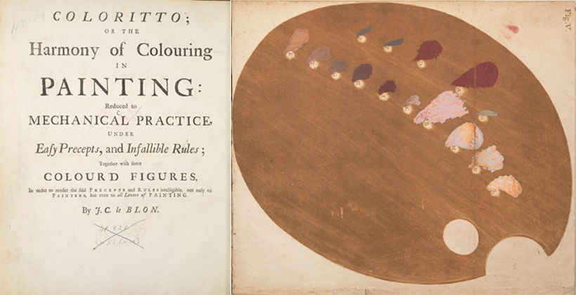
German-born artist Jacob Christoph Le Blon, who was predominantly based in France, proposed a groundbreaking color system based on Newton’s optical study and Goethe’s theory of colors. A painter and engraver, Le Blon travelled extensively, from Switzerland to the Netherlands, to study coloring techniques. In 1725, he published Coloritto, a book on the harmony of coloring based on his research in relation to the mezzotint method for multi-colored engraving. As the first person to apply the three primary colors of red, blue, and yellow to engraving and printing, he proved that the addition of black to the three primary colors should allow printing in all colors. He removed green from the then-accepted four primary color systems, eventually becoming the forerunner of the four primary color systems of CMYK that we now use in color printing. Through his emphasis on distinguishing the additive color system, primarily related to light, from the subtractive color system, expressed in pigments, he cleared much of the confusion in people’s understanding of colors at the time. He also asserted that removing one of the four primary colors would reduce costs for printing, but engravings and prints were still in black and white then. The era of color printing was still too far away.
Advances in Color Expression Techniques
Europe in the 18th century was the hub of creating a wide range of dynamic changes. Kings and queens of the absolute monarchy wished to be perceived as enlightened rulers, which resulted in many artists and technicians residing within the premises of European palaces. Similarly to the painters of the Joseon Dynasty in Dohwawon, or the Korean Royal Bureau of Painting, artists in European palaces were also instructed to capture the authority and wealth of the monarchs. With extravagant royal palaces situated at the heart, large European cities attracted countless people in various professions. Among such people were ‘colormen,’ whose job was to handle color pigments.
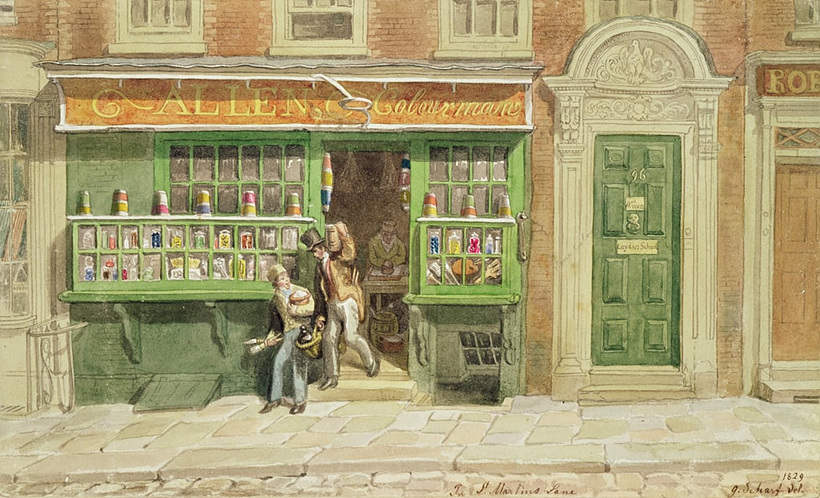
Much like alchemists or apothecaries of the previous eras, colormen produced and provided pigments and paints to artists. Creating accurate colors is an intricate job. Processing a wide range of minerals and natural materials to create chemically-stable colors is not an easy task, even to this day. Only after enduring years of apprenticeship to learn the skills and have their ability to handle hundreds of pigments recognized could people at the time strike out on their own as ‘colormen.’ Colormen operated both as pigment stores and art supplies providers. With the advances of civilization and increasing resources, the select few colormen were taken over by corporations who took their roles. Towards the end of the 18th century, color paints were provided in an art supplies box, and paint companies emerged, some of which have remained household names to this day. Handling colors has always been a field that requires the expertise of a handful of specialists.
During the times when colormen were active, many color guides were published. The ability to discern colors through understanding and comparing colors was one of the most crucial qualities of a painter. Most of the color systems at the time were illustrated in the form of a color wheel, similar to Newton’s diagram. Typically, similar colors were indicated adjacent to each other, while complementary colors were indicated opposite from each other. Color theory books of this period competed against each other based on the color chart’s precision and wealth of colors. With the advances in color expression technologies, thanks to the increasing number of colormen and art supplies companies, the two-dimensional pages of these books eventually proved insufficient to fit all the available colors.
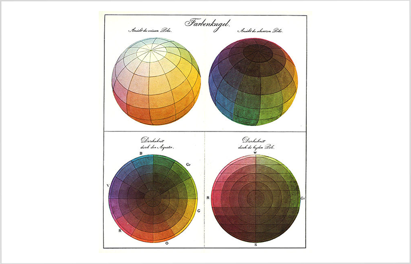
In 1810, Phillip Otto Runge proposed a color sphere in an attempt to address the limitations of the two-dimensional color wheel. White and black were indicated respectively at the top and bottom poles, with the rest of the colors allocated in the space in between. The ever-important task of introducing a three-dimensional color system illustration was then undertaken by Albert Henry Munsell, who published A Color Notation in 1900. An American painter and art teacher, Munsell poured his heart and soul into establishing a color system. His color sphere gradually transformed into the shape of a tree as he added and subtracted colors. The resulting color tree, which outlines the relationship between the three elements of hue, chroma, and value, laid the foundation for the large bodies of research on color systems that followed.
Meanwhile, German scholar Friedrich Wilhelm Ostwald devoted himself to studying color systems after winning the Nobel Prize in Chemistry in 1909, the culmination of which was his The Color Primer and treatise Harmony of Color, published respectively in 1916 and 1909. Although Munsell’s color system had already been gaining ground, Ostwald disagreed with the classification of hue, chroma, and value but instead proposed that colors be classified as neutral colors, which were between black and white; full colors, which contained no grey; and mixed colors, which contained grey. Ostwald’s color system was meticulous to the extent that the amounts of black and white added to other colors were quantified to precisely capture the granular differences. However, his color system was received with criticism that it was too difficult to understand and eventually banned in his own country Germany, although it was received with praise from Britain and America, where his color system served as the basis of producing color paints.
Three Primary Color Systems and Displays
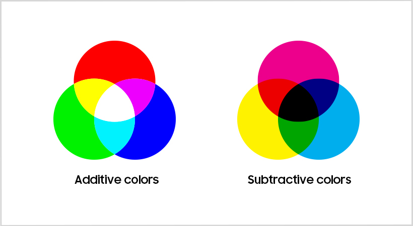
Meanwhile, the optical color system — or the additive color system in contrast to the subtractive colors used for inks or pigments — sustained its life after Newton’s optical experiments. Through British scientist Thomas Young and German physicist Hermann von Helmholtz in the early 19th century, the optical color theory gave birth to the scientific inference that the human retina contains receptors for the three primary colors of red, green, and blue. Taking this scientific inference, American physicist Ogden Rood published his treatise Modern Chromatics: with Applications to Art and Industry in 1878.
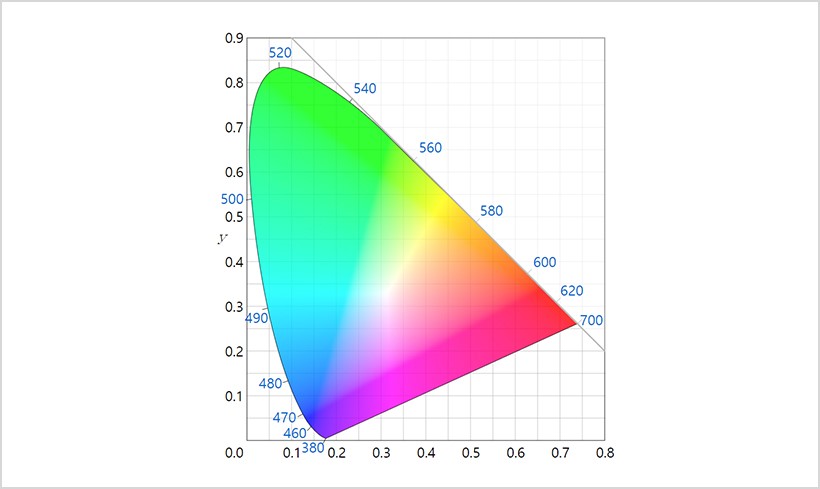
Unlike most of the color theory books at the time, Rood’s published work only contained a few diagrams, which later became the CIE 1931 color spaces that we are familiar with today. His most outstanding achievement is to connect the subtractive colors of paints to the wavelengths of the visible spectrum, which are characterized by additive colors. His integrated color system instantly made global waves, particularly having a remarkable impact on Impressionist artists. Impressionists used short brushstrokes with primary colors to avoid using dull colors in their paintings, which was their attempt at expressing the optical colors with paint. The challenging journey of establishing a set of standards for colors, often filled with debates, took another turn with the introduction of display devices in the 20th century, replacing paper.
Nam June Paik, one of Korea’s most renowned media artists, claimed that TV screens would replace canvases. A composer and performance artist, Paik collaborated with Japanese technician Shuya Abe in 1964 to develop the first video synthesizer that creates optical color effects on TV screens. With his synthesizer, Paik created a unique psychedelic style using visual effects when most of his contemporaries were preoccupied with traditional filming and editing videos. In the same way that the visible color spectrum is part of the electromagnetic spectrum, he realized early on that manipulating the electromagnetic field from the electronic gun toward the TV screen would allow him to create the color patterns he wanted.
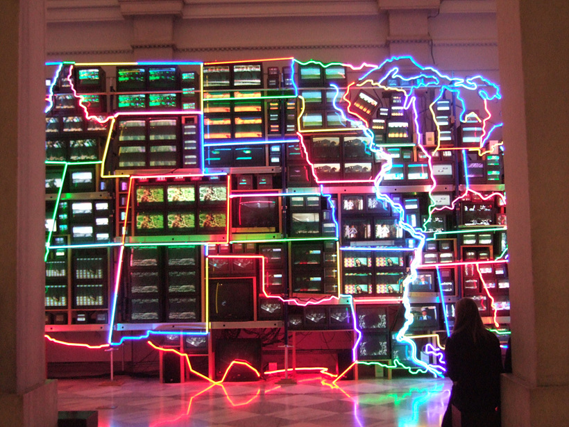
Fifty years after Paik’s synthesizer, media art became a genre of art that can be enjoyed by anyone from children to the elderly. Anyone without any particular talent in manual drawing can create an image on the computer screen to sell online and create video content to share with audiences around the world. As implied by Paik, display devices are a moving canvas for a new generation of artists. Media artists use display devices as their digital canvas. From the contrast ratio to the various detailed color depictions, what is illustrated in an image can be recreated on displays.
The long journey of finding order in colors has seen colormen’s pigments and color wheels developed by scholars and finally reached today’s digital displays. We no longer need color paints — we now have displays in front of us, emitting bright light and showing vibrant colors.
