
In his book, ‘Theory of Colours’, literary giant and expert in the psychology of colors Johann Wolfgang von Goethe argued that yellow has the highest level of color intensity, followed by orange, red, green, blue, and purple. It may not instantly make sense to some that colors can have intensity, but research on color intensity began as early as the 17th and 18th centuries. It is a crucial characteristic of color, used as a critical concept in the interaction of color and the theory of color harmony.

The fact that colors have intensity means that colors can significantly influence our judgment of what we see. Compared to images in achromatic colors such as white, gray, and black, chromatic colors are often considered to deliver more information such as seasons, and are positively perceived in terms of the image quality as well.
In fact, the more colors an image contains, the higher its chances of being perceived as having better image quality. This is related to how our memory works. Our brain tends to perceive colors to be more saturated than they actually are, in order to remember something. This supports the claim that people perceive color images to be more positive.
Therefore, the intensity (strength) of colors that an image contains has a critical impact on the perception of image quality. In addition, the stronger the interaction between colors in an image, the higher the contrast becomes, which leads to the perception that the image has greater quality.
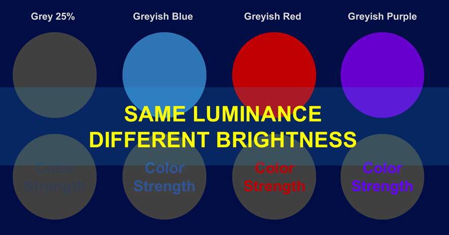
The intensity of each color also impacts its brightness. Even if the luminance of two colors is the same, each color has a different level of brightness [1] . The higher the purity of a color, the higher its luminance is perceived to be than what it actually is. In other words, color purity is positively correlated to intensity.
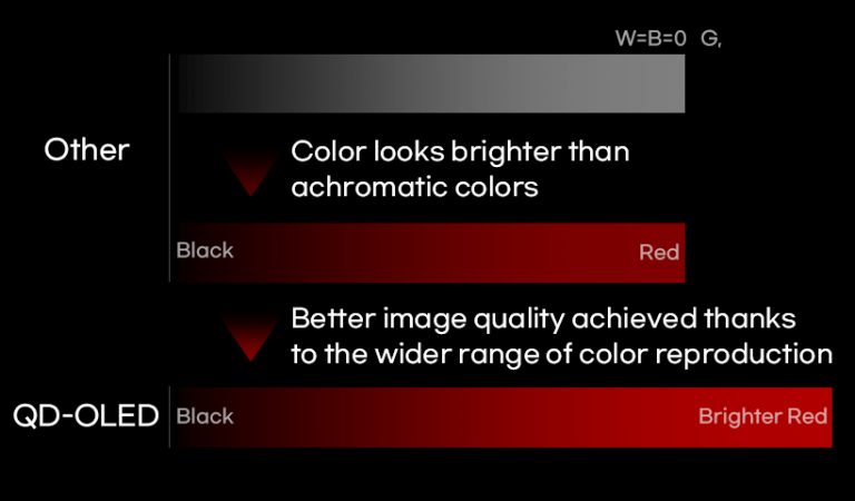
[1] The colors on Samsung Display’s QD-OLED display seem much brighter when compared to colors of the same luminance on other display panels that use different technologies. This is referred to as eXperienced Color Range (XCR).
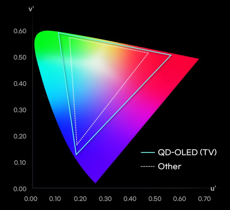
It shows that the range of color reproduction on the QD-OLED display is wider compared to other displays.
As displays are electronic devices that reproduce images, industry-wide efforts are being made toward hardware and software development to achieve the goal of enhancing image quality on displays and capturing the colors of nature as vividly as possible. In particular, technologies that expand the color gamut (the range of colors reproduced) have seen further advancement thanks to the development of the QD-OLED technology.
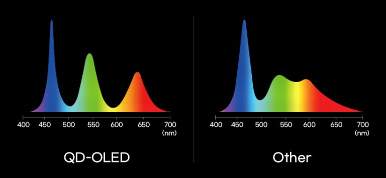
the separation between each RGB color and their respective wavelengths on the spectrum
mean higher levels of color purity.
Each pixel of QD-OLED represents the high purity of the primary RGB colors (red, green, and blue), preventing the adjacent colors from mixing and ensuring that the RGB colors are more saturated. As the display allows the reproduction of purer and more accurate colors, the color gamut has become significantly greater than its existing counterparts. The wider color gamut not only captures the colors in nature that have so far been considered challenging to reproduce on a display panel but also enables the reproduction of those colors in higher levels of saturation. As explained, colors of higher purity have greater intensity, meaning colors on the QD-OLED display seem brighter at the same luminance meaning.
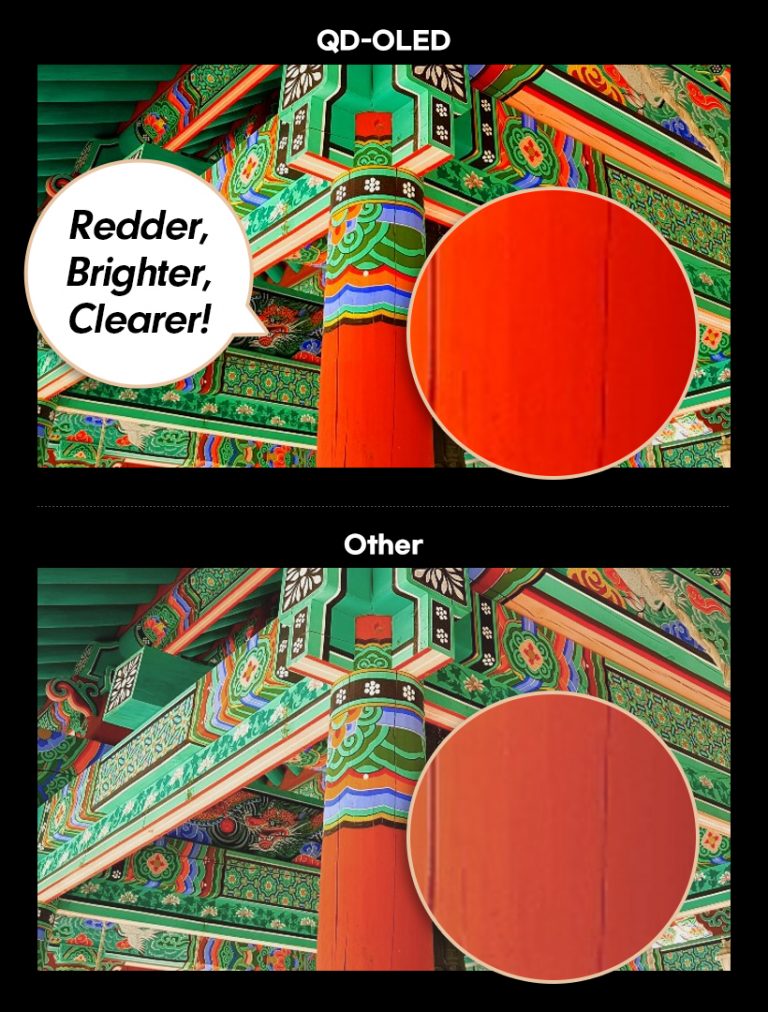
Highly saturated colors leave stronger impressions and are far off from achromatic colors such as black and white. These impressions can be described as “color strength”. The colors on the QD-OLED display correspond to “bright” and “vivid” impressions. An image comprised
of bright and saturated colors gives the impression that the image is clear as a whole.
natural image quality from dark to bright scenes.
Colors with a high level of color strength are perceived to be brighter compared to achromatic colors with the same level of brightness. To put it simply, a red color will seem brighter when it is more saturated. Therefore, the expanded color gamut creates clearer, deeper, and more vivid colors because it can capture a wider range of colors from highlights to shadows of an object.
QD-OLED, which effectively leverages the characteristics of color strength, can reproduce detailed images by increasing the brightness and darkness of a color. At the same time, its wider color gamut and higher purity bring greater depth to colors. The QD-OLED display is expected to achieve image quality with greater depth and clarity, unlike anything on the market.

SCHOOL OF DESIGN,
EWHA WOMAN'S UNIVERSITY
