
While luminance has been the primary metric for display brightness, it only accounts for the luminous intensity per unit area of light and can be measured using machines. Nit is the standard unit of measurement for luminance. A higher number of nits indicates a brighter display.
However, nits don’t fully capture the complexities of how humans perceive content on a display. What to make of this conundrum?
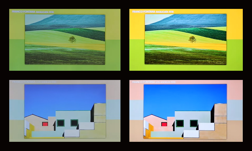
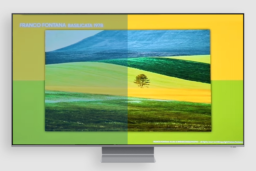
The above two photos are a good case in point. A photo by Italian artist Franco Fontana, a master of color photography, is displayed in two different TV screens. Which photo is brighter, the photo on the left screen or on the right screen? Most people will indicate that the photo on the right side is brighter, but surprisingly, the left and right TV screens are set at the same luminance!
Some scientists have conducted research on this deceptive phenomenon of colors of the same luminance appearing differently. In 1860, German physicists Hermann von Helmholtz and V.A. Kohlrausch made a groundbreaking discovery that colors with the same luminance can have varying levels of perceived brightness, and that colors with higher saturation tend to appear brighter.
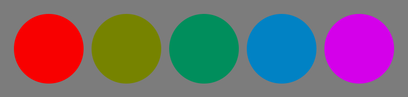
For the skeptics and doubters, we present the below photo with five circles. Despite same luminance for all five colors, a person might perceive the red circle on the far left side or the purple circle on the far right side as the brightest. Interesting, right?
We now recognize that relying solely on luminance as a metric in measuring display performance is insufficient. In order to make an accurate assessment, color saturation must also be taken into account. However, it can be frustrating if our subjective experience does not align with the numerical measurements. For example, to the naked eye, a photo on left may appear dull while a photo on the right may appear bright. When measured by a machine, however, both photos may be assigned identical scores. Indeed, such discrepancy may be confusing!
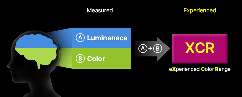
The Experienced Color Range (XCR) is a concept that emerged as a solution to address the long-standing frustration in the industry. The XCR draws on the work of Helmholtz and Kohlrausch, referred as the H-K effect, to predict and quantify brightness in numerical terms. The Munsell Color Science Lab at the Rochester Institute of Technology, with support from Samsung Display, conducted a study on brightness that incorporated the H-K effect. Their findings suggest that perceived brightness, as quantified by the H-K effect, is a better indicator of the characteristics of the human visual system compared to traditional measures of brightness, which rely solely on luminance.
XCR represents a game-changing approach to designing, developing, and evaluating displays, as high-definition (HDR) specifications continue to gain prominence. With brighter highlights and darker shadows being increasingly sought after, XCR is poised to make a significant difference in the industry. When developing displays for gaming or movie viewing, considering XCR numbers from the outset can enable developers to create superior products. Furthermore, XCR can serve as a helpful guide to ensure users consistently experience the same level of brightness when viewing content across different devices, such as smartphones, laptops, XR goggles, and medical devices.
XCR is a new paradigm for measuring brightness. If you're serious about display specifications, keeping XCR in mind is crucial for staying ahead of the curve!
